6 Gorgeous Color Schemes for Every Style + My Top Color Tips

Color can totally change the look and feel of a space! Check out some of my favorite, stylish color combinations and get my tips for decorating with color.
Depending on your comfort level, color can be exciting or intimidating. Because it impacts every layer of our designs, color is often where we begin when kicking off a new project. My saturated designs tend to pop on social media and stick in people’s minds, but a peek at my portfolio reveals we’ve composed just as many neutral spaces as we have colorful. Here’s a roundup of some color palettes I love.

Coordinated Neutrals
This look is all about texture. Think soft upholstery, buttery leather, shag rugs, honed marble, crackled glass. Layering fabrics and finishes brings depth and visual interest to the space. Neutral color schemes are a quiet backdrop for letting outstanding views or favorite artwork shine.

Contrasting Neutrals
Another way to nail a neutral color scheme is by taking a bolder approach. When you amp up the contrast, you get an edgier vibe. The juxtaposition of light and dark is dynamic and energetic. Mixing in lots of texture ensures the space still feels warm and inviting.
Softened Shades
Colorful doesn’t have to mean bright. Muted shades, such as lilac and moss green, are wonderful way to include an array of colors without it feeling overwhelming. This approach strikes a balance between fresh and sophisticated.

Nature-Inspired
You can’t go wrong when you draw your inspiration from Mother Nature. This color scheme calls to mind the sea and sand, with soothing blues and airy shades of white and cream. It’s an ideal look for a beach home or any space where you desire a sense of calm.
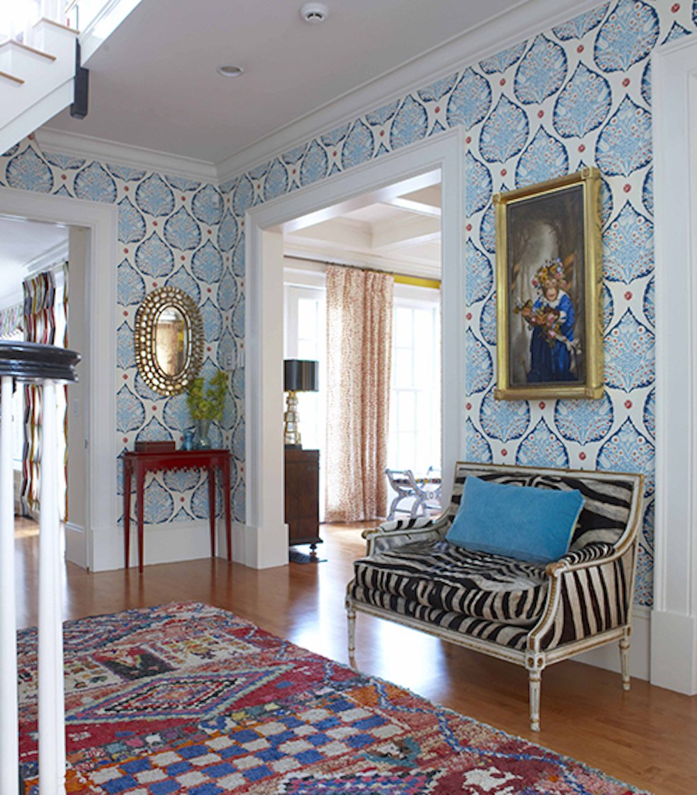
Bold & Bright
For some, the bolder the better! This look features lots of high intensity primary colors. It feels vibrant and energetic. For a color scheme like this, it’s helpful to use an art collection, patterned wallpaper, or fabric motif as a starting point.
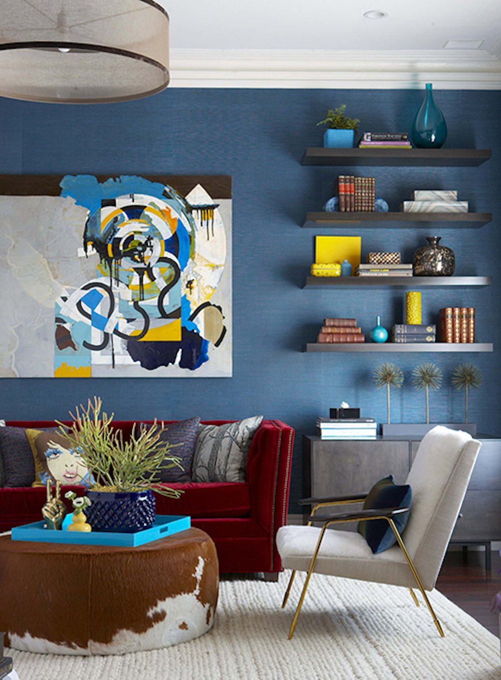
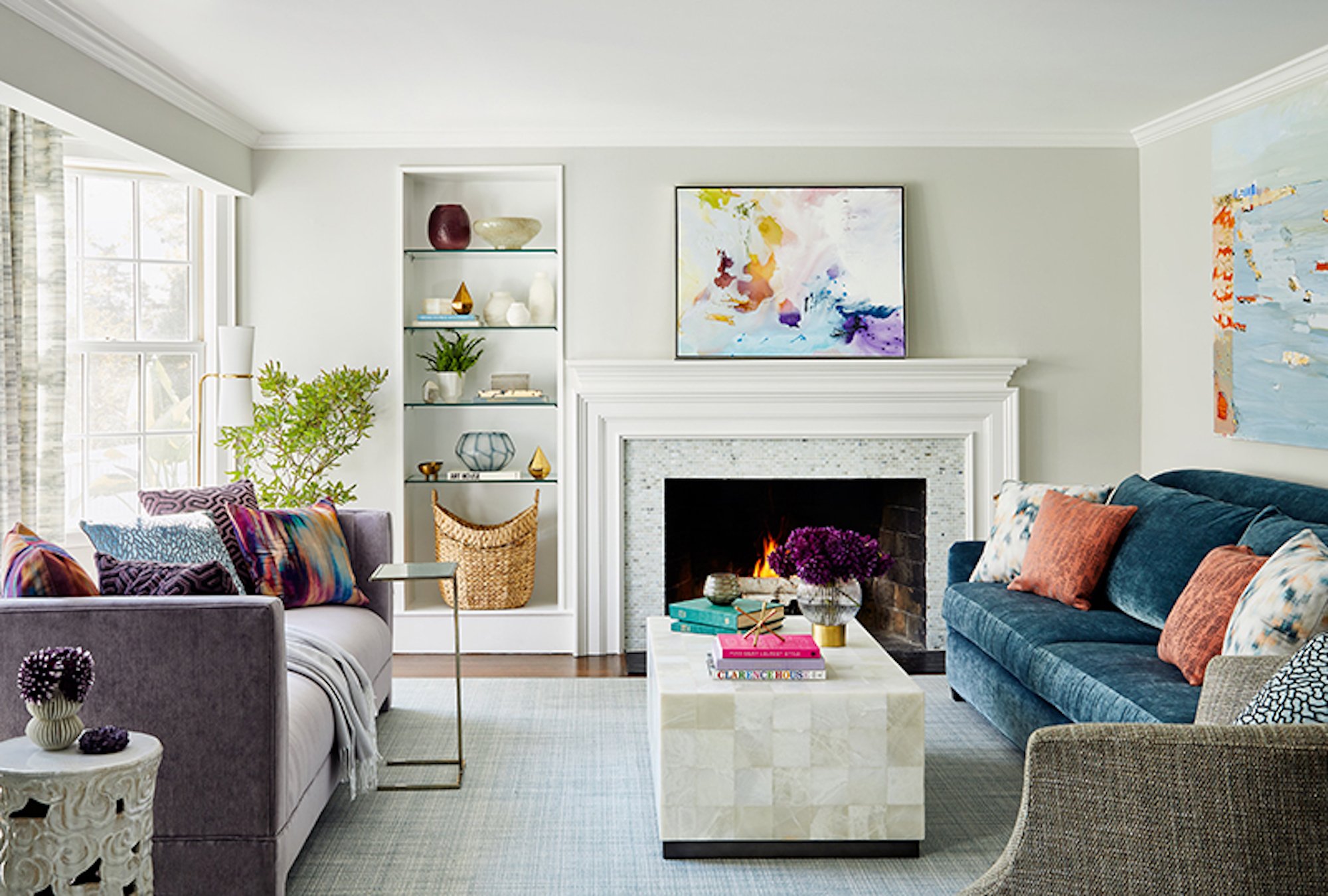
Rich Jewel Tones
Saturated colors, such as purple, teal, and emerald are not for the faint-of-heart, but they truly evoke a luxurious vibe. Combine them with sumptuous fabrics, glittering metallics, and unique finishes for a glam look that still feels comfortable.
Regardless of the colors you choose, I have some general tips for making it work:
1. Think about the space as a whole so the colors work together vs. compete with each other.
2. Vary the tones of the colors so they don’t fade together or feel overwhelming.
3. Use color strategically to highlight what you want to be the focal points.
4. Give your eye a place to rest, often this can be upholstery.
5. Remember how metallics and woods have undertones and can help balance out a space.
Until next time,